

bar chart
This block is part of the Component UI group and was last modified in core v10.4.28.
bar chart v10.4.28 Basic bar chart
In pins 21
- Name required
value - Data
array - X Axis required
fielddefinitions - Y Axis required
fielddefinitions - Row Colors
arraySets the colors of the background rows
- Data colors
arraySets the colors of the lines
- Title align
valueAlign the title, options: Left, Center, Right
- Theme
value - Color palette
valueChanges the colors of the lines to presets made by Apexcharts
- Height
number - Horizontal
conditionRotates the chart 90 degress and shows the data horizontal
- Stacked
conditionStacks the data on top of each other instead of next to each other
- Bar Width
valueSets the width of the bars, use px or % to determine the width
- Spacing
numberSpacing between bars
- Show data labels
condition - Label Position
valuePosition of the Data Label, options: Top, Center, Bottom
- Label Offset Y
number - Label Offset X
number - Label fontsize
value - Label Color
value - Zoom
condition
Out pins 1
- uicomponent
uicomponent
graph |
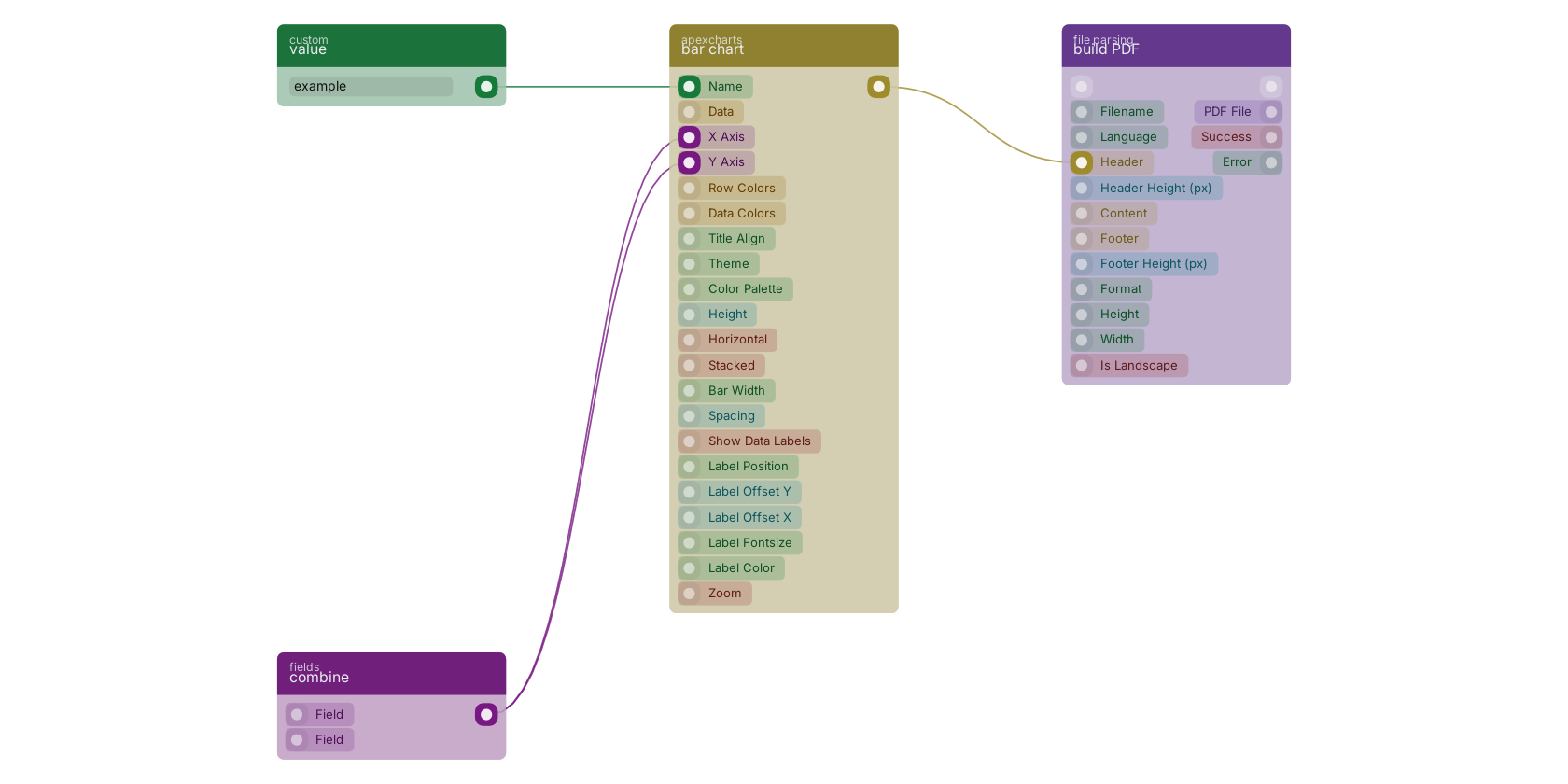
A typical wiring for bar chart: value feeds the co-name pin; combine feeds the co-xaxis pin; combine feeds the co-yaxis pin; the uicomponent out pin feeds build PDF.
Version history
Introduced in v10.4.28.
Back to
Component UI Return to the main group to view all sub-groups Back to apexcharts Return to the group to view all blocks within this group